I recently visited the Wizarding World of Harry Potter theme park in Orlando, and of course I absolutely had to buy candy at Honeydukes to bring home, especially to compare to the movie prop replicas I designed for my own parties way back when!
If they had sold “official” Chocolate Frogs that looked like the movie version when I was hosting my parties, I definitely would have bought them. Sadly they were not available so I used screen shots from the DVD of the first movie and designed my own. My first versions were a little larger than the current version on sale in my Etsy shop that goes with the custom frosting sheets for edible card cookies, but since I wanted the inside of the lid to match colors, I shrank it a little to be able to fit on a single letter sheet in my printer. I refined the design over my several years of parties to have easier instructions and less paper cost, but they are still a challenging papercraft project because of the pentagonal peaked box and the nesting lid and base. Many of my Etsy buyers agree that the effort is worth it! ![]()
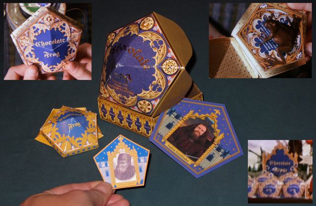
As you can see the official theme park version is quite different from the movie prop version. We only saw closeups of the Chocolate Frogs in the very first movie, so these are 11-year-old Harry’s hands, but it’s still not as huge as the theme park box! The movie version has a lid that nests over the base edge, plus a lip around the
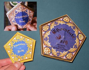 bottom of the base, which is how I designed mine. The theme park version has no bottom lip, the sides are taller so they stretched the quatrefoil design, and the lid is attached to the base with scallops that tuck into the sides of the base. The chocolate frog itself is solid and HUGE! The card fits perfectly inside the box & looks very close to the movie version, but Godric just boringly stands there looking straight ahead, so I think the lenticular movement is wasted.
On the lid, I think it was a very odd choice to place the fold overlap right in the middle of the word Frog. I worked hard on getting that to not conflict with the lettering in my design. I think that looks really goofy with the cockeyed F separate from “rog”! Of course they have the technology to be fancy with actual metallic gold 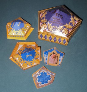 lettering. I would love to add real gold foil to mine, but I did add a texture pattern in the gold color to help look metallic.
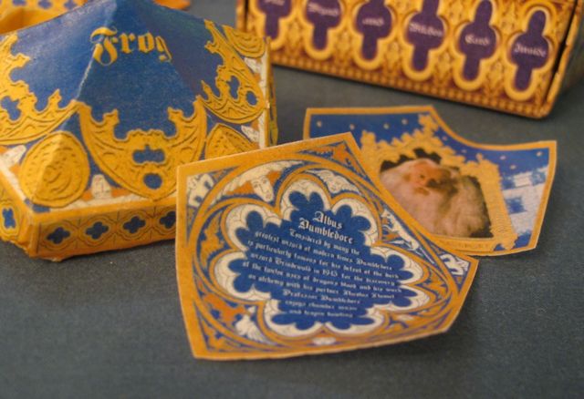
Since I had already played with baking Chocolate Frog Card cookies that fit inside the papercraft boxes, I decided to try printing the boxes on edible rice paper. Assembling them was tricky since the rice paper needs gentle scoring to fold instead of tear, so patience is required. They are very fragile so I don’t think they would support a cookie card very well, but they worked! Just a tiny dab of water with a small brush and a squeeze where I would use double-sided tape glued the rice paper together. Too much water dissolves the rice paper completely of course. I am still impressed at the resolution I can get on the rice paper and frosting sheets…you can even read the text on the back of the rice paper card! ![]()

 Subscribe RSS